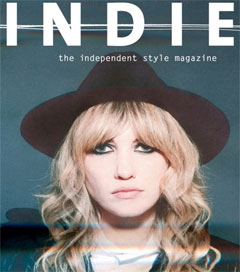
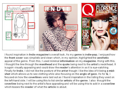
This is a Prezi showing my font decisions of what I have chosen to use on my front cover for my masthead, features and issue date.
Friday, 29 January 2016
Wednesday, 20 January 2016
Final Shot/Mise-En-Scene.
This is an image made through PowerPoint explaining why I have chosen my final shot and how it links to my genre as well as audience.
Test Shots - Front Cover.
This is a YouTube video showing my test shots I have done for the front cover of my music magazine. In this, I have explained why I have chosen the image against the others.

Monday, 18 January 2016
Creating the Artist's Look.
This is a YouTube video showing the process of transforming my model to link to my chosen genre, Indie-Pop before testing out shots for the front cover of my magazine. (Credits to Hibah Jan for this idea.)
Props - Meaning.
 Hat - Simple and small props during photo shoots with indie-pop artists are popular as it links to elegance and sophistication as well as appearing intimate and personal. I chose a large hat as a staple prop because commonly, in indie-pop, accessories such as hats or jewelry to draw in attention as well as keeping focus to the artist's face. An example of using a simple prop such as a hat is done in Indie magazine's Lady Hawke issue. With bold eyes and simple make up, the staple accessory was her hat.
Flower Crown/Flowers - Sticking to a theme of elegance and beauty, indie-pop commonly uses flowers and flower-crowns in photo shoots with famous artists such as Lana Del Rey. A largely associated word with the sub-genre is 'twee', meaning cute (although at the beginning of indie-pop was used in a derogatory tone), flower-crowns and flowers add to the 'twee' but sweet and posed image.
Wednesday, 13 January 2016
Shot List.
This is a SlideShare explaining the reasons behind the shots I have created and how they link to my chosen genre, Indie-Pop.
Saturday, 9 January 2016
Flatplan.
This is a clean version of my flatplan draft. As you can see, the overlook look of it is clean cut and sophisticated with little information on the front cover. I have done this because looking at my research and what my target audience links the genre indie-pop to a magazine (especially the front cover) that is not cluttered with information or teasers, coverlines etc works effectively to grab their attention. Along with this, the image appears black and white however I chose my feature colour to be a deep blue which is seen in the small graphic of the world along with the quote from the artist, the title of 'Features'. The lighting dots and 'V' will also be in the feature colour on the double page spread. 

Visual Moodboard.
This is an Animoto of my visual moodboard. In this, I have shown some pictures and words which I believe represent my chosen genre, Indie-Pop and what I want to recreate in my music magazine. This has clarified my understanding and ideas as I will recreate them through colour schemes, shots, layouts, props etc in order to attract my target audience.
Thursday, 7 January 2016
Artist Profile.
This is an EMaze about the artist of my genre, Indie-Pop. 'Valerie De Luca' is loosely based off Lana Del Rey as I have looked and gathered some information about her as an artist however I did attempt to create the artist off my original ideas. Overall, I am happy with the outcome of the way I have shaped my artist for my music magazine.
Consent Picture:
Tuesday, 5 January 2016
Audience Research (Focused).
This is a script for the video of my focus group. These were the questions I was planning to ask and how I was going to set out the video.
Analysis: This is a YouTube video of an interview with two teenagers as my focus group. In this, we discussed different magazine covers as well as a contents page and double page spread. I have gained more in-depth knowledge about my target audience's preferences and views about conventions on magazines in order to attract them to my own music magazine. By going through not only front covers but looking at a contents page and double page spread, I was able to understand what can be unappealing to my target audience as well as what features and image styles, layouts and such attract them. I found that Rolling Stones was the magazine most preferred between the two students and also matched the indie-pop genre the most as the others looked 'busy' or 'crowded'. A seemingly air-brushed picture with a fierce look attracts the audience more than a relaxed photograph. These few points and the overall interview has shaped my opinion in deciding different conventions and becoming to think about how the layout of my magazine may look along with the props or body language and facial expression of my artist. I will take on board these opinions so the final product will reach the interests of my target audience.
Consent Pictures:
Consent Pictures:
Subscribe to:
Comments (Atom)


